
I’ve been contemplating what to write as a way of summarizing this roller-coaster of a year. There have been plenty of ups and downs, but what I want to focus on this year is what I was able to ship. As Seth Godin wrote earlier this week:
If it doesn’t ship, it doesn’t count.
Freelance Career
I still consider myself in “shipping” mode with this, but back in May 2010 I made the leap to full-time freelance and I haven’t looked back. This has been one of the best decisions of my entire life, and has been the launching point for so much of what I’ve been able to ship this year.
Tim Latham

This past spring, I received an email from Tim Latham, a Grammy-winning music engineer from New York City. He had seen a project I had worked on previously and wanted me to redesign his website. We launched in the Summer of 2010 and I’m very proud of how the project turned out.
Church & Charity WordPress Themes

I was approached on a couple of occasions this year to design premium WordPress themes. Adam Pickering of ChurchThemer asked me to design a set of WordPress themes aimed at churches and para-church organizations. We were able to ship that theme this past Fall.
I was later asked by Chris Wallace of UpThemes to design a WordPress theme for his company. I ultimately decided to design a WordPress theme for charities. The theme was shipped this past December.
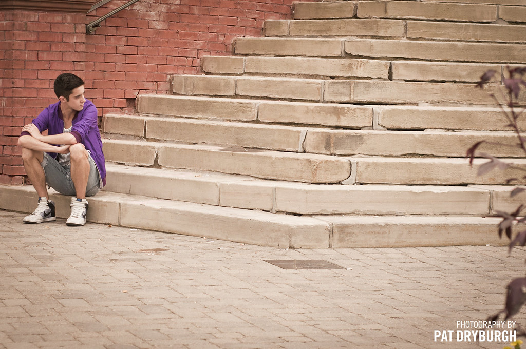
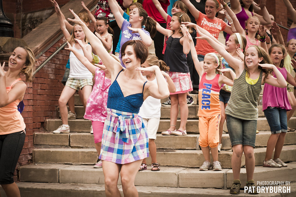
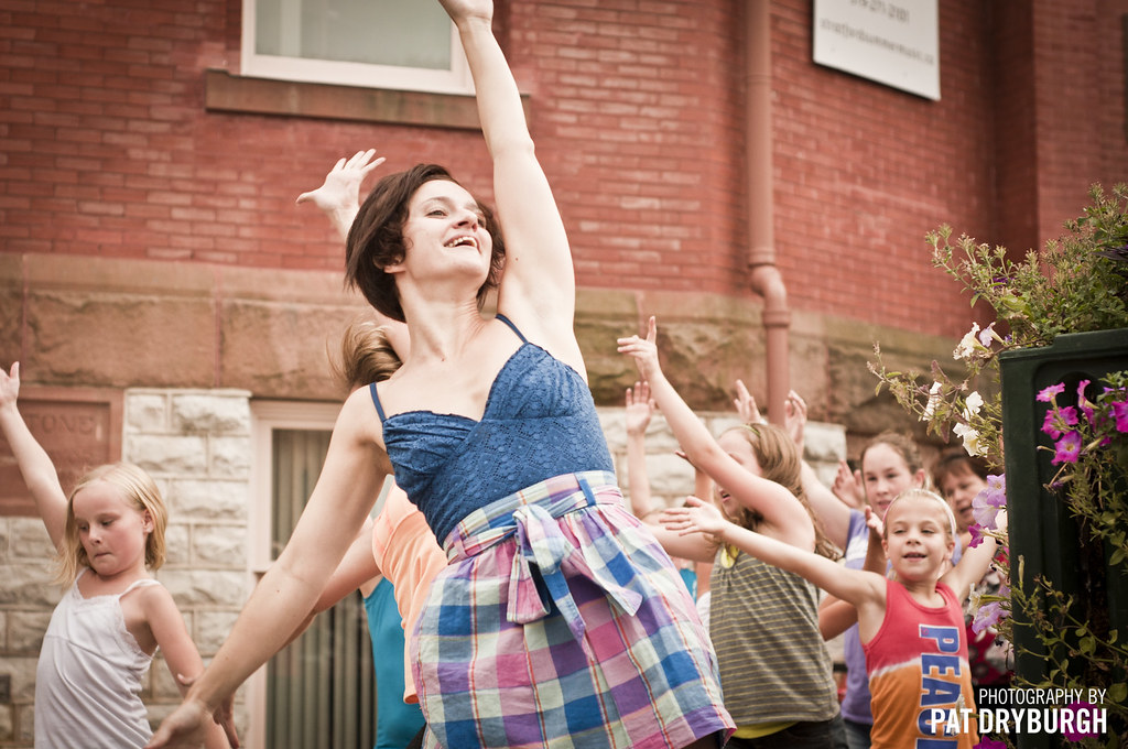
Photography

This is an interesting aspect of my life that I don’t talk about a whole lot, other than when I post some of the photographs I’ve been taking. Ever since purchasing my Nikon D90 last December I have been working hard at learning the craft and expanding my experiences with it.
I consider that I have “shipped” photography this year, not only because of the photos I have shared, but because within one year I was able to grow in the craft, enjoy some incredible photography-related experiences, and even land my first paid photography gig. In fact, I’ve even lined up my second one for some time next year. While I don’t expect photography to take over my design profession any time soon, it’s nice to have a hobby I enjoy which also brings in a little cash on its own (hopefully enough to start paying for some upgraded equipment!)
Simple Desks

What started as a personal project has turned into… well, I’m not even sure what to call it. Whatever it is, over 4000 combined readers/followers have found something to enjoy about Simple Desks.
With the new year upon us, I’m very proud to announce that Simple Desks has been added to the Fusion Ads roster. I’m so pleased to now have both my personal site and my fun side project included in this amazing network.
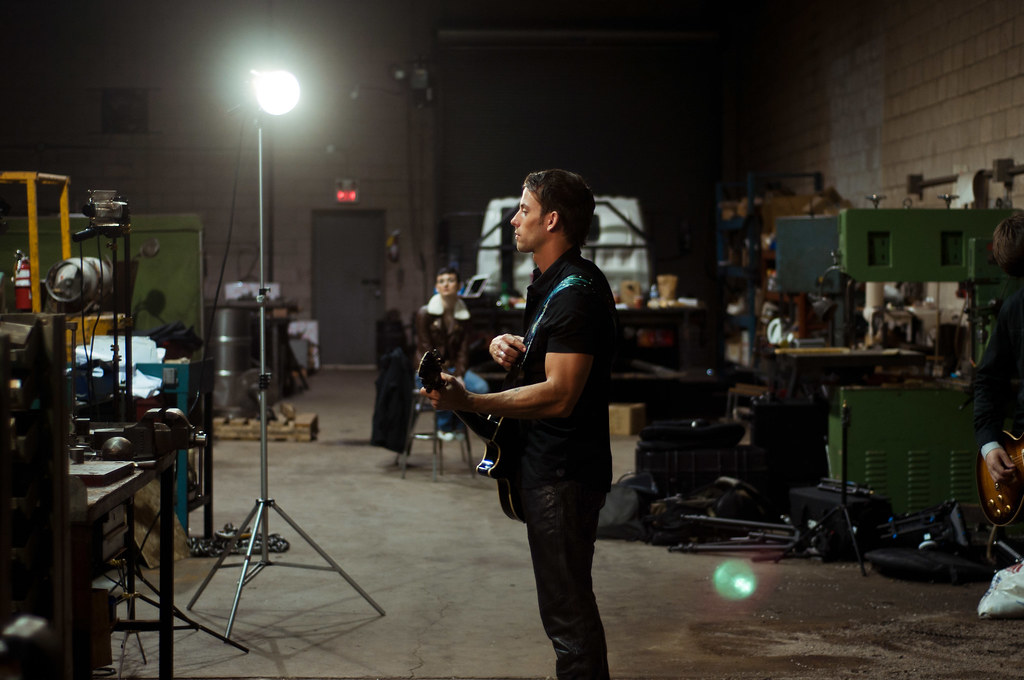
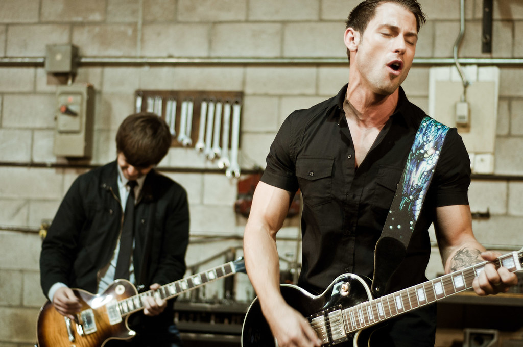
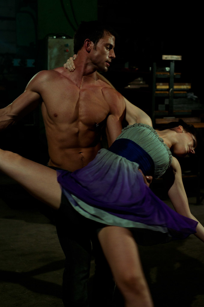
Boss Rebel Album

Over the course of the Spring, my band Boss Rebel was in the studio recording our newest full-length album, “Heavybad.” We shipped the album in August 2010, and have had an amazing time promoting it at shows and other venues since its release.
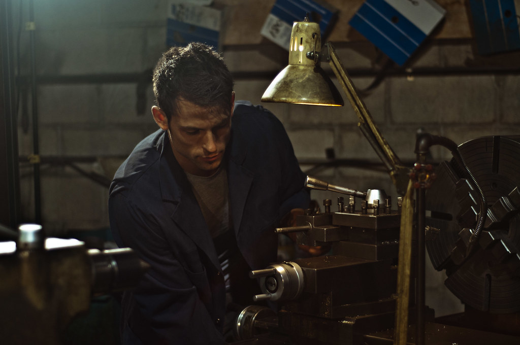
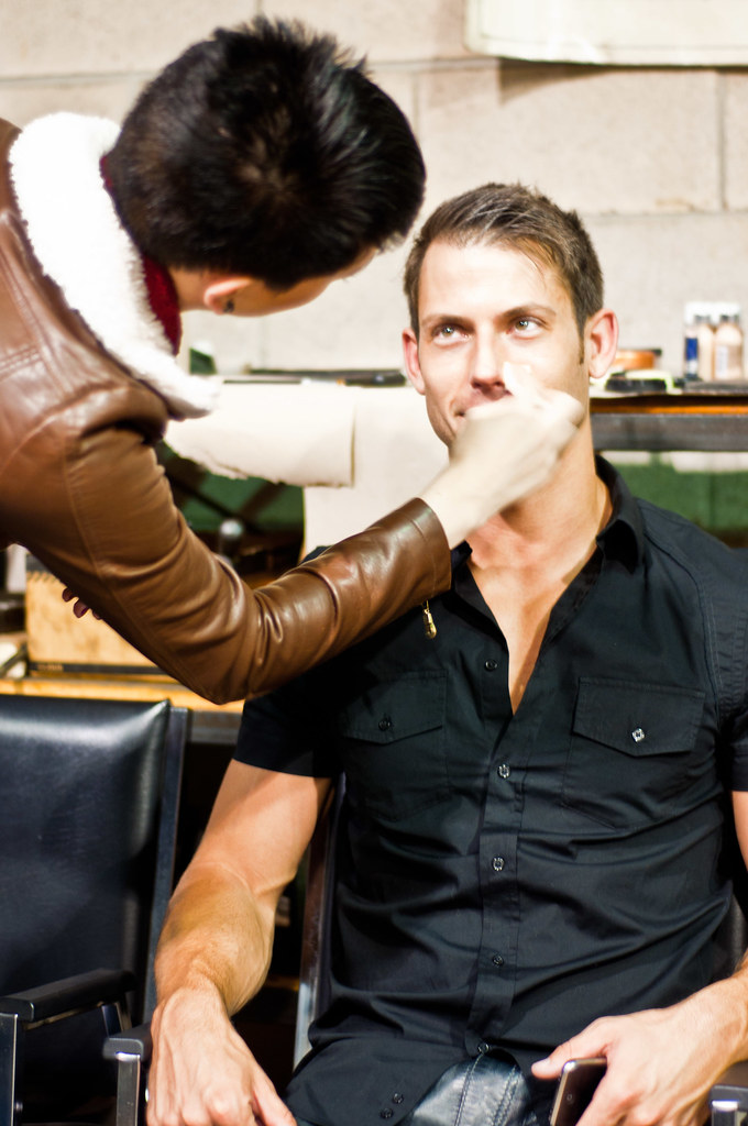
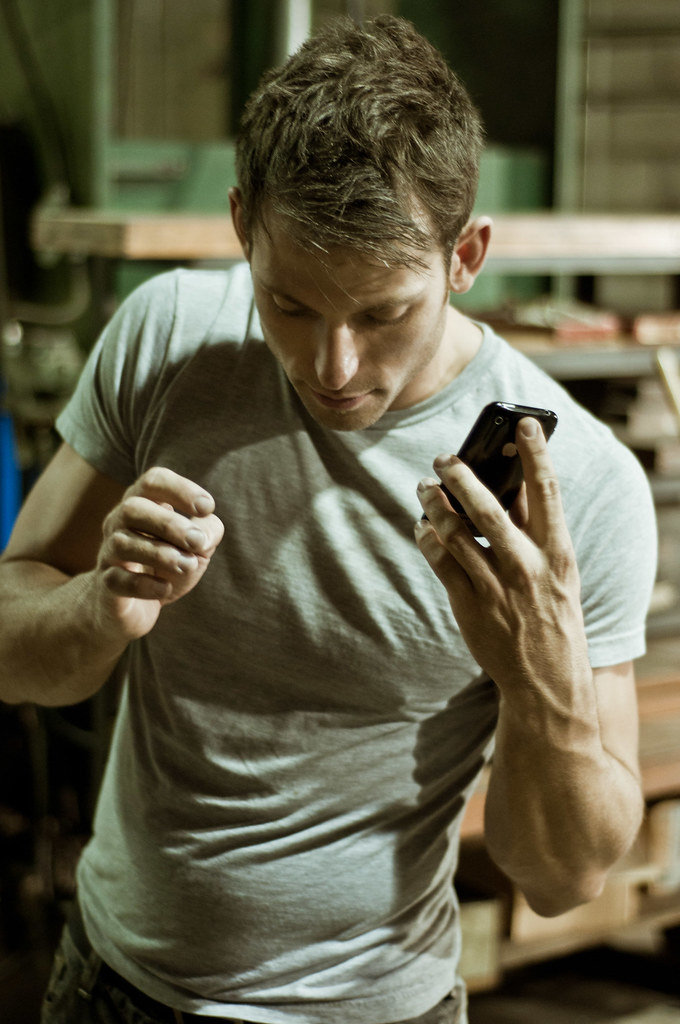
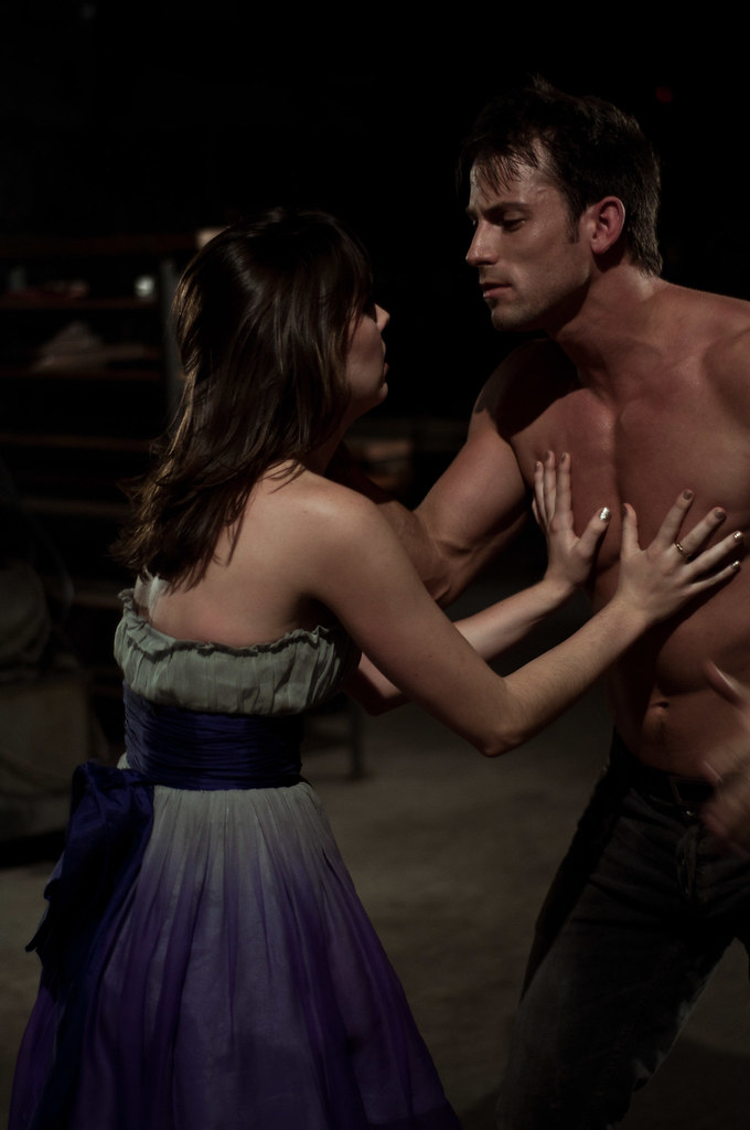
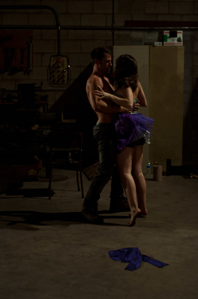
Heavybad Music Video

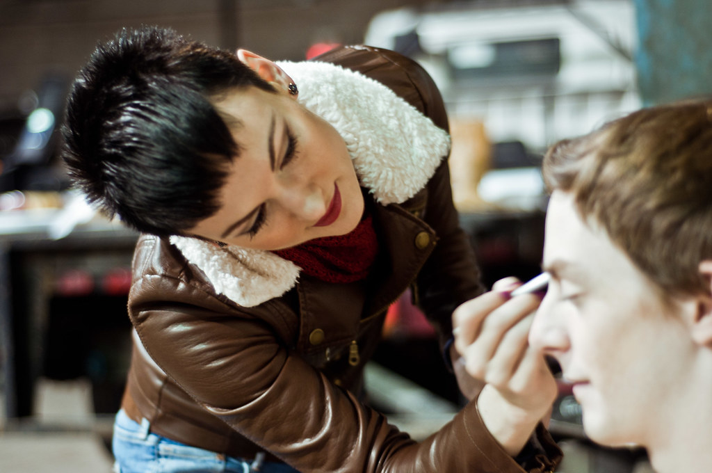
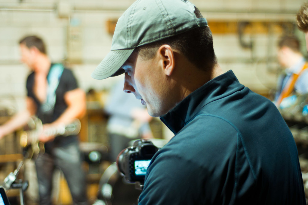
In the Summer of 2010 my friend Edward Platero offered to shoot a music video for my band. 3 days, 30 extras, a keg of beer, two guitars destroyed by a pool, and a now infamous Speedo led to what became my band’s first music video. We shipped in the Fall, and began work on our second video in October.
New and Improved Website. And Another.
Last month I was proud to release a new site for my portfolio. Powered by ExpressionEngine (affiliate link), it was the first step towards bringing harmony to everything I do online. This week, I shipped the second iteration of that design, and so far it has been rather well received. I couldn’t be happier.
It’s amazing to look back on the year focused on the positives. Viewed through the lens of some of the struggles that have come this year, it’s even more amazing I was able to accomplish all of this. I want to make sure I effectively communicate to all of you how much it’s meant to have your help, support and encouragement this year. Thank you. Thank you very much.
※ Permalink for “2010: What I Shipped” published on date_to_rfc822


