I’ve been putting this off for a while now, waiting for my site to finally feel settled. With the launch of the new design yesterday, I decided today would be the opportune time to share what led to where I am today.
I’m going to start with a couple of terrible, incomplete, but necessary screenshots. These were when I was first trying out the Athlete brand. Looking back, I’m almost embarrassed to say I designed these, however design is not just about the end product but about the process by which we get there.
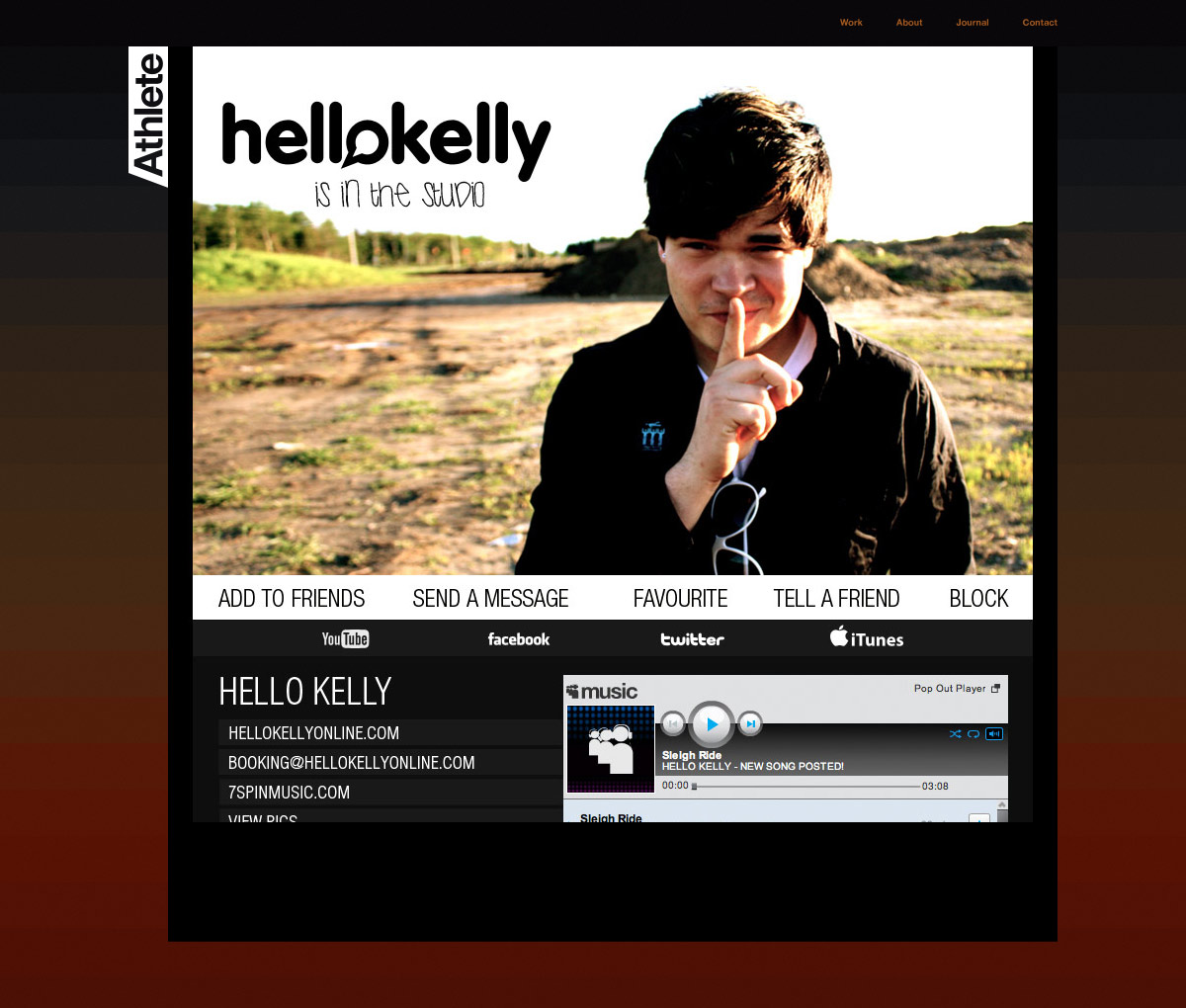
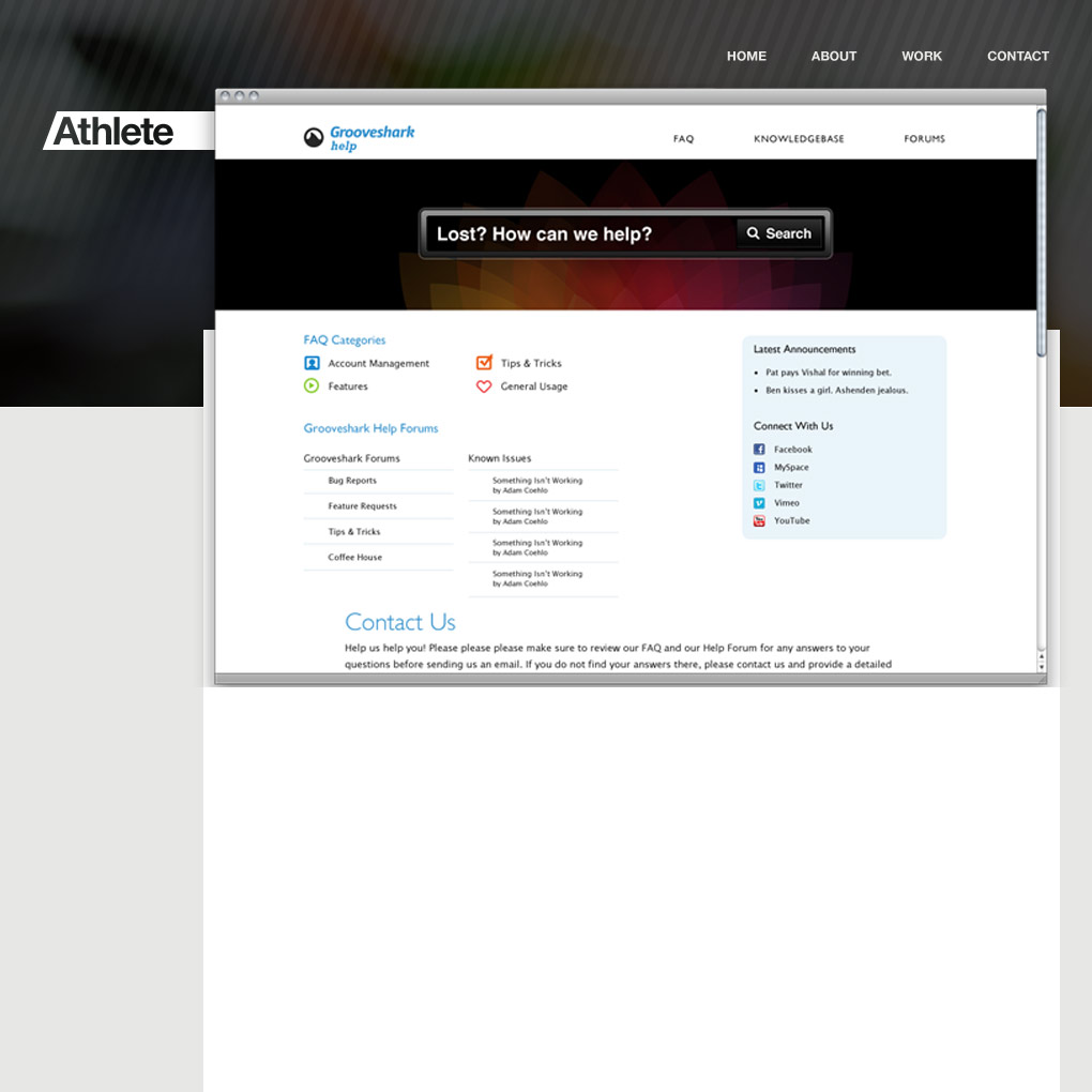
Sometimes I design things like this just to get a feel of how certain elements work together, such as the browser frame jutting out from the top of the content section to give the design some depth. It also gives me a chance to work out the type of grid I want to use to build my content in.
Once I had gotten these out of my system, it was time to buckle down and really think about what I wanted to communicate. I was just getting into photography, and was thinking about ways to showcase some of the higher quality work I was producing. I also wanted to play with some big, bold type and Helvetica Neue, a personal favourite, was an obvious choice.
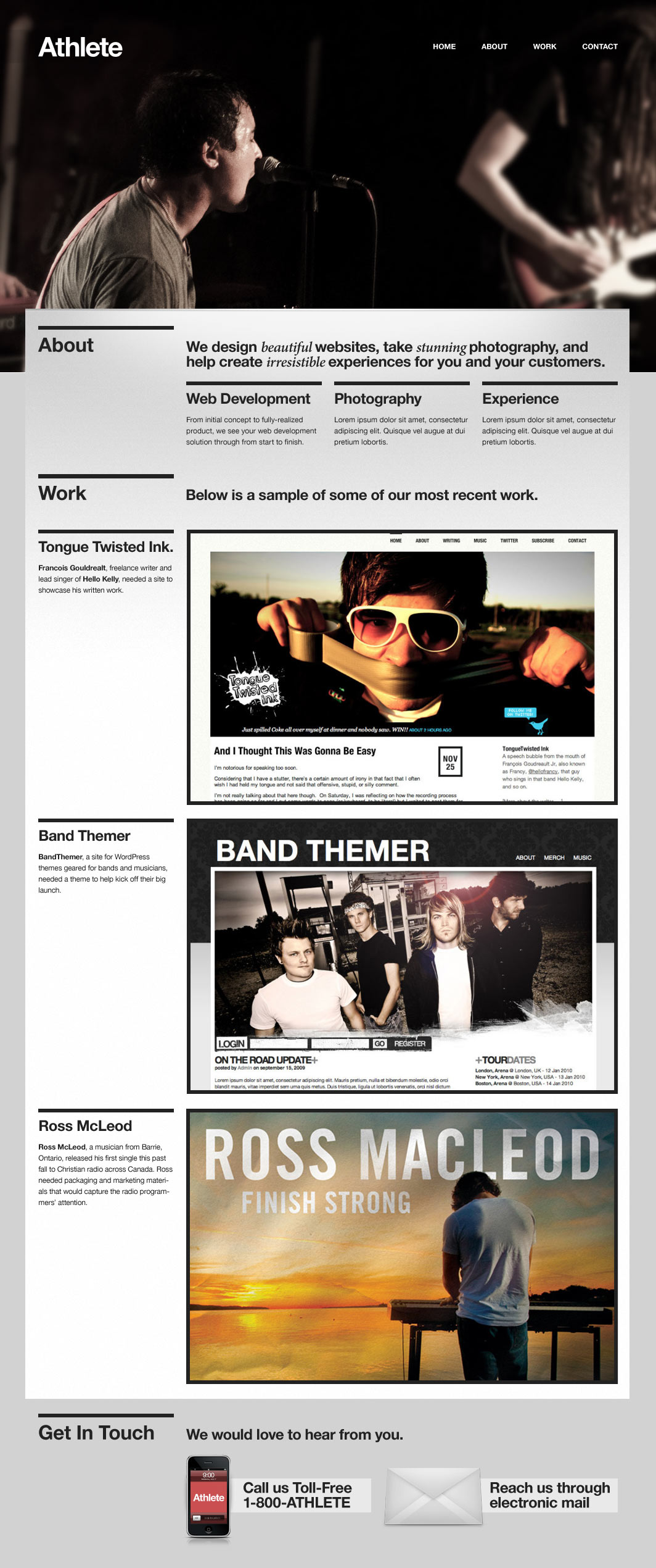
I actually completely finished this site, and was so close to pushing it live when it was done. I had some amazing help from friends like Jonathan Christopher and Phil Coffman, who really helped me hone in on how to get this site to function and look its best.
This was my first experiment in using the Pods CMS plugin for WordPress, and it really changed how I viewed WordPress as a content management system. In the past I have built sites using WordPress and a messy array of custom fields that I would later have to explain to the client. Using Pods, I could create unique panels for each set of data I would have to work with, creating fields for only the types of data I would need. For instance, the Portfolio Pod only had a title, a screenshot, a project link, and a description. I didn’t have to mess around with custom fields or other pieces I wouldn’t need. It was really a dream come true.
I am still very proud of this design, and it took a lot for me to let it go. What I eventually realized, however, was that it was so dependant on my photography that, should I not have the chance to take appropriate shots for the header section, the design would quickly get stale. Plus, it really felt more like a band’s website with the musicians in the header.
So, I went back to the drawing board. I realized I wanted a few specific things out of my design:
- A clean, minimal layout.
- Beautiful typography.
- A header image that would rotate through different projects.
- A way to display client testimonials.
Around this time, I started playing around with a tagline that would become the driving force behind my freelance company:
We craft amazing experiences.
About a year ago I wrote a blog post about taking pride in your craft. It was a revelation to me to begin thinking about design as a craft; something you constantly develop and perfect over time. During my time at the church I worked at I had also developed a passion for creating irresistible experiences. I wanted what I created to be of such high quality that people couldn’t help but be drawn in.
With all of this in mind, I struck out in a new direction. I made some modifications to the amazing 960 grid system by Nathan Smith to extend it to 1008 pixels wide by increasing the margins to 12px. This gave the typography a bit more room to breathe, as well as allowing the screenshots and photography to display a bit wider than normal.
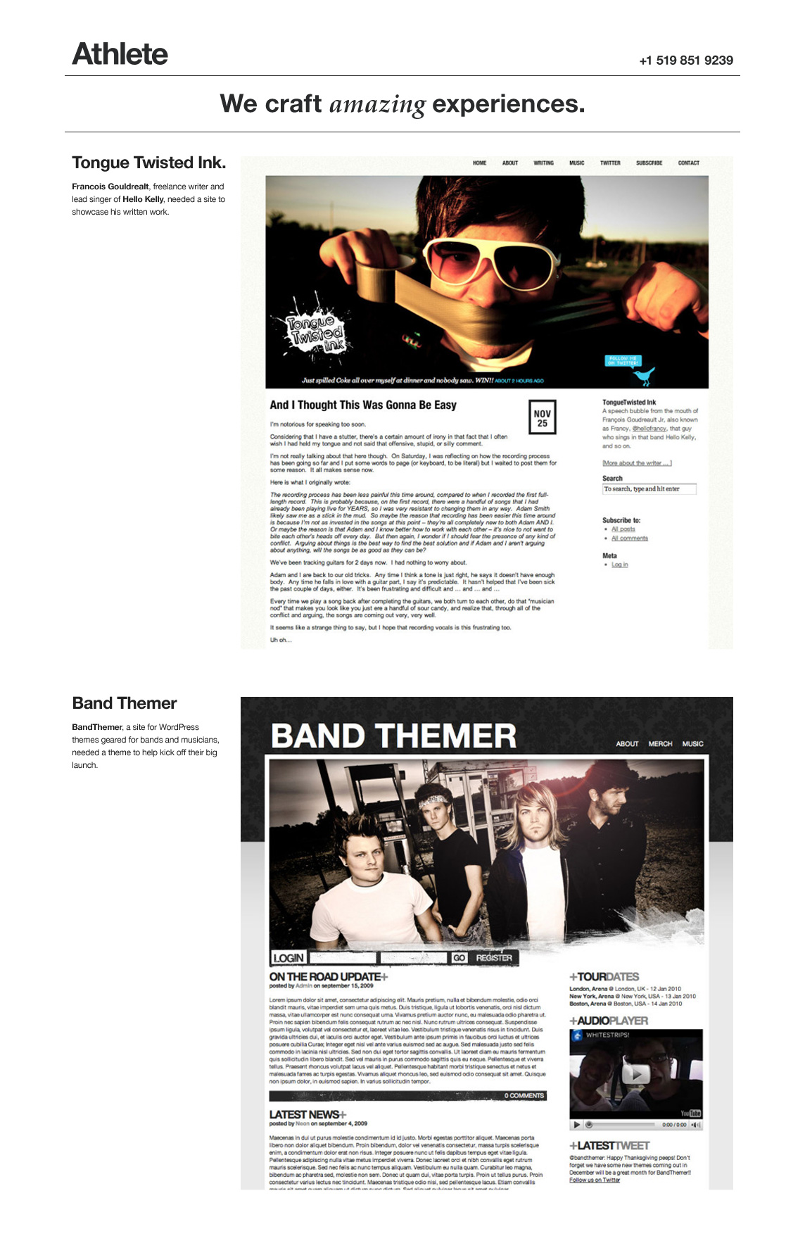
This design really followed the same general layout of the previous shot, with type on the left of the screenshot. What this meant was that the screenshots weren’t quite as wide as I would like. This site also really felt incomplete. All it could really do was display projects, not communicate what I could offer. And so, back to the drawing board again.
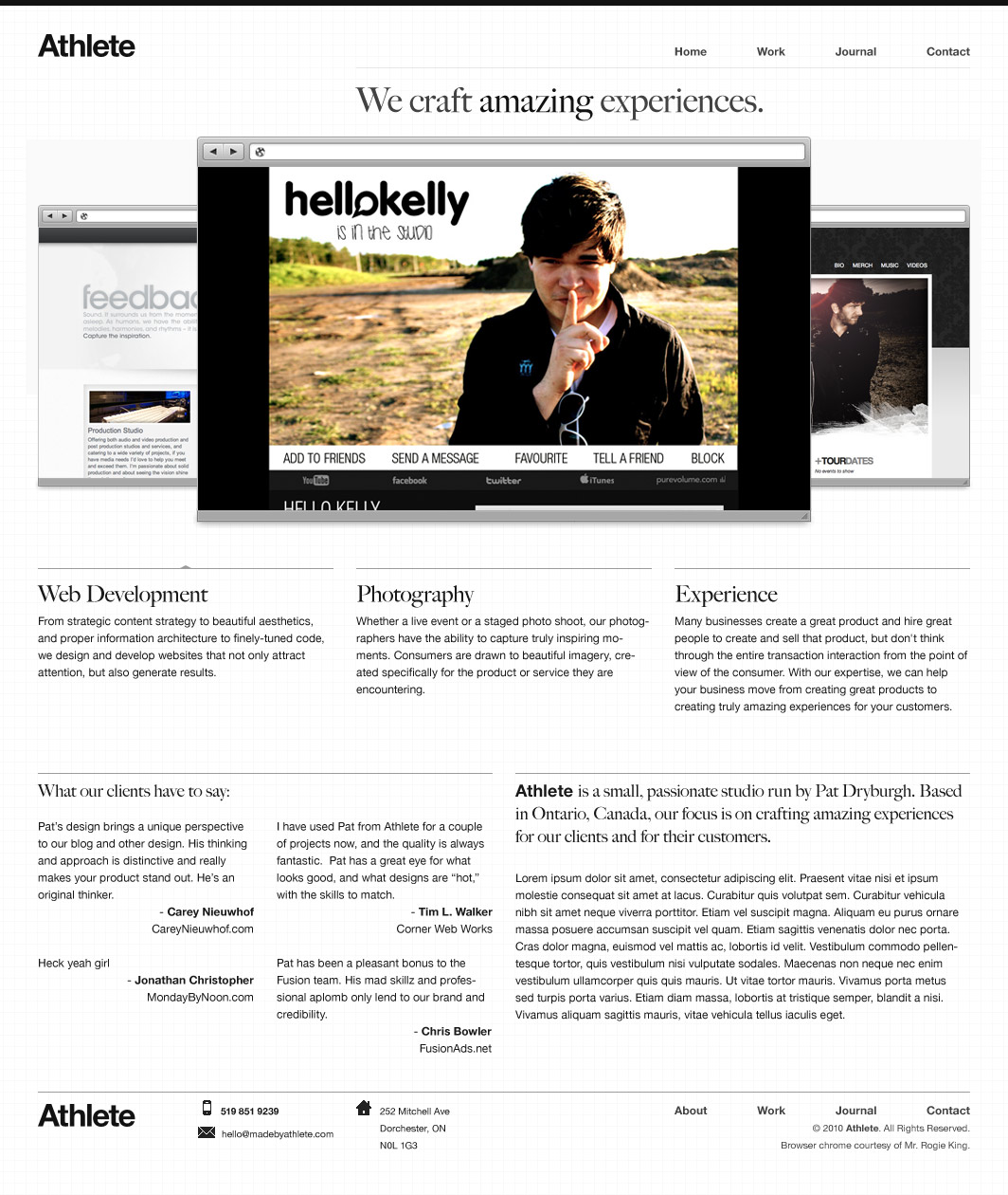
There are few things I am as proud of as this design. I felt it had beautiful typography, clear communication of what I offered, a beautiful wide display, and clean lines everywhere. The browser chrome, which is also featured on Sam Brown’s new Massive Blue design, was generously supplied by my friend Rogie King.
Some people made the comment that this site had a lot of content to read, to which I would reply, “That’s the point!” I knew that the types of clients I wanted to work with would not be put off by maybe 600 words of text. Through clear information hierarchy, I felt I was able to clearly communicate what I did, what people who I had down work for felt about what I did, and present a bit of a sales pitch down at the bottom (which didn’t get written until later on).
I was also pretty proud of the icons I designed for this design. I am not a great icon designer, but inspired by work I had been seeing on Dribbble around the time I was working on this design, I figured it couldn’t hurt to try. You can see some of the icon design process here.
In so many ways I felt this design was the right way to go, however I still needed to tweak it a bit. There was another layout around this time that I unfortunately can’t find a screenshot for. The main display image took up the entire width of the site, and had a height of almost 600px. It was big, bold, and very “me” in a lot of ways. Not sure why I talked myself out of it, but I did. I still regret that decision.
After several retries, several designs and a bit of fighting with WordPress, I finally felt I had come up with something I would be happy with for a long time.
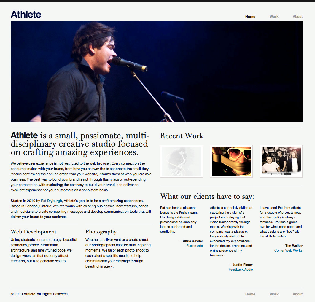
This site was full of win for me. From the logo on the front page that revealed a sliver of the screenshot beneath (idea courtesy of Rogie King), to the inclusion of a “recent work” section, to a more balanced look throughout, I really felt this site was a strong design.
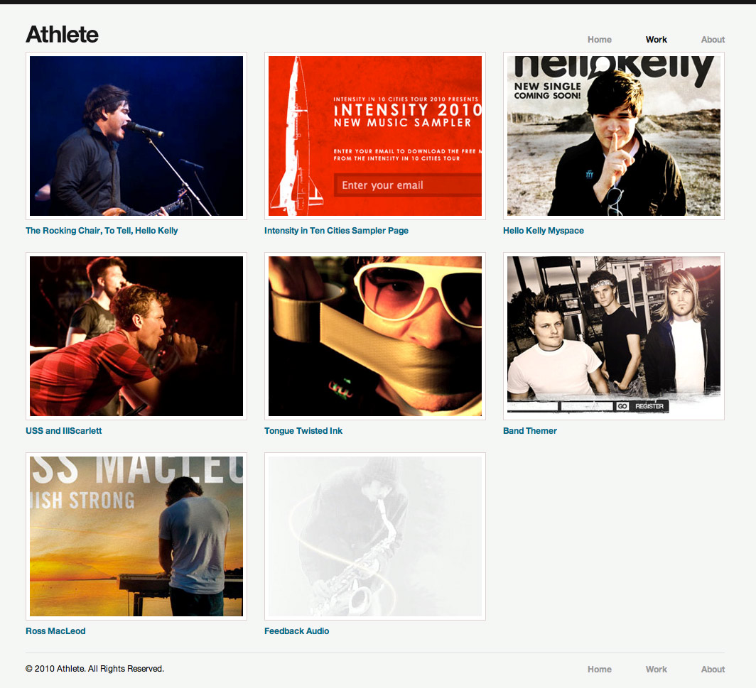
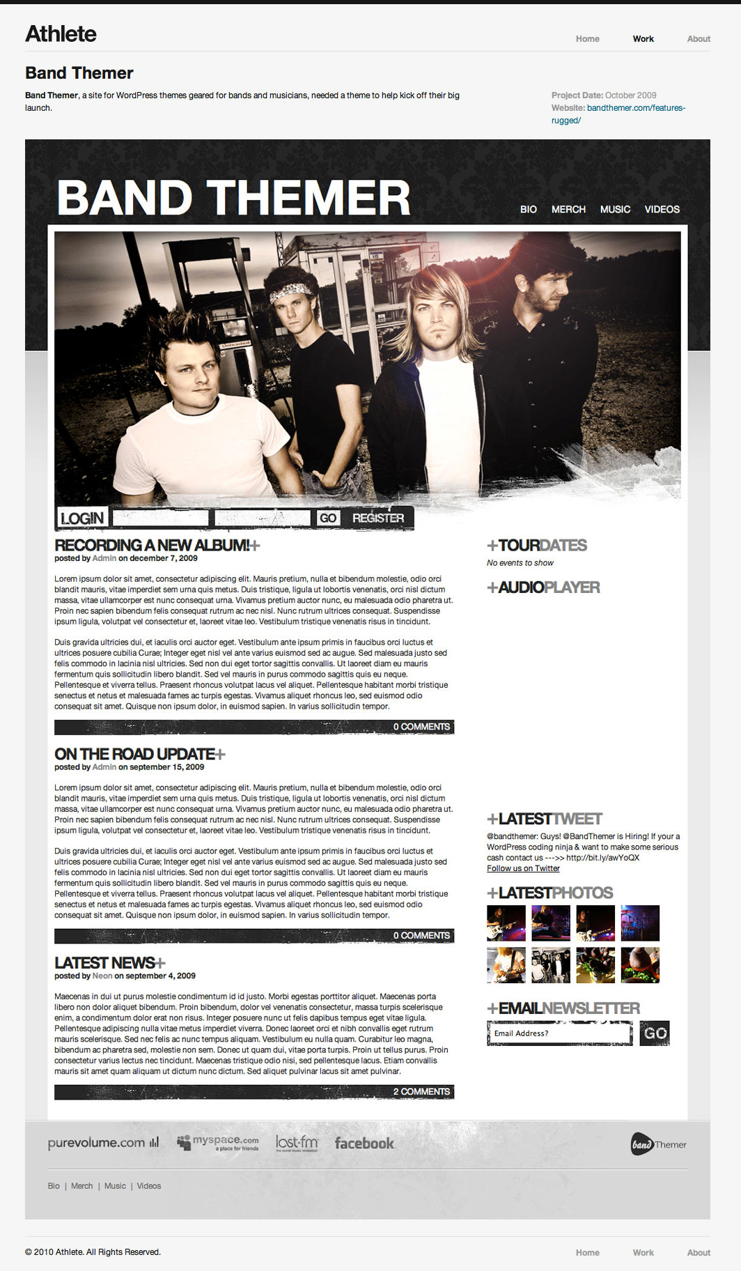
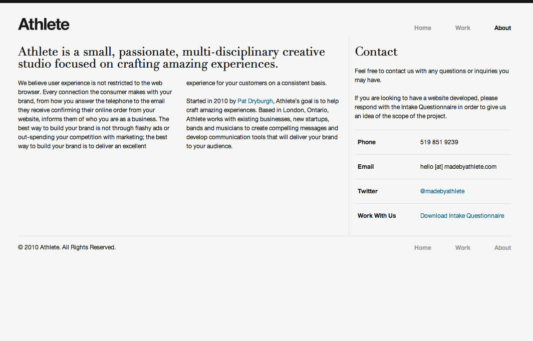
What this site did lack, however, was personality. Looking back, it feels a bit like a template taken from somewhere on the web. The masthead image is plain, the navigation is plain, the overall look is, well, plain.
After launching the site, I submitted it to several design galleries. I do this not so much for the recognition but for the benefits of having large sites link to you. However, as embarrassing as it is to admit, not even CSSMania — who appears to accept just about anything with a CSS file linked to it — didn’t even accept the submission. Justified or not, this really stuck out as another indication that this design was just a little too plain.
So, back to the drawing board yet again. This time, I was starting to question whether the Made by Athlete brand was appropriate for me (which, as I announced yesterday, wasn’t) so I began working on a new design with my own personal branding.
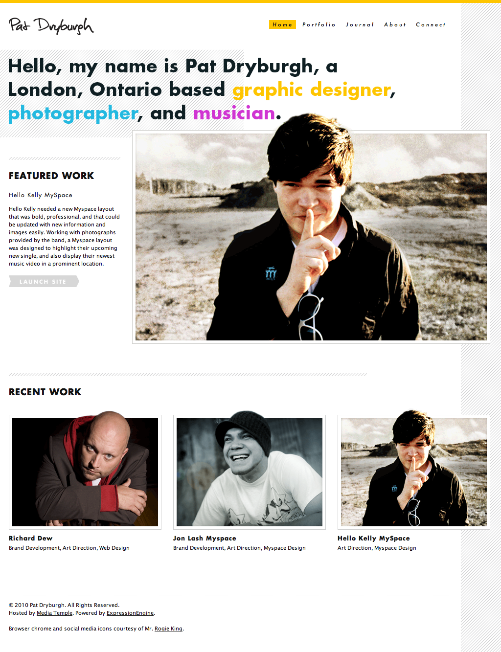
Using the same 1008px grid I used on the Made by Athlete design, I constructed this site that really portrayed personality while still communicating what I do. I really liked how Paravel let their screenshots break out of the box, and I wanted to do something similar to my site. Looking back, I think the implementation is a little too close to what they have done, but I was still a ways away from launching this.
I really loved the diagonal lines on the side of the site, that stretched to the right as far as your browser window would allow. I also liked that I reintroduced the overlapping effect with the main display image, giving the site some depth.
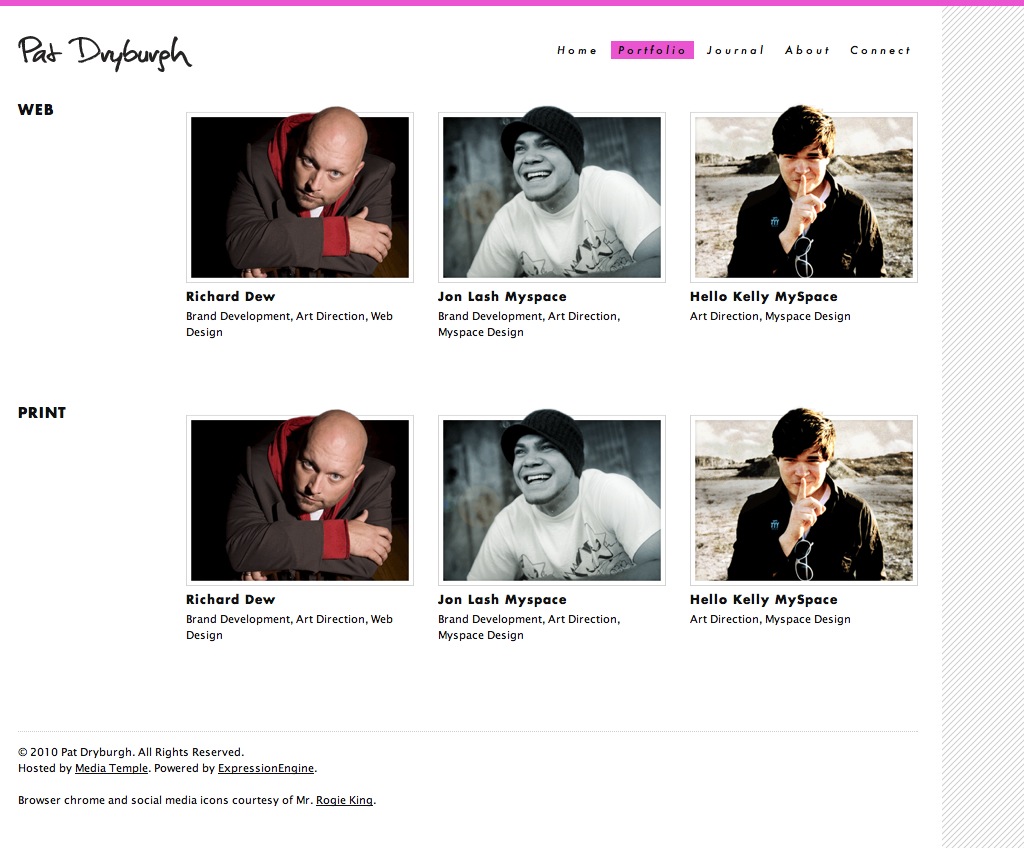
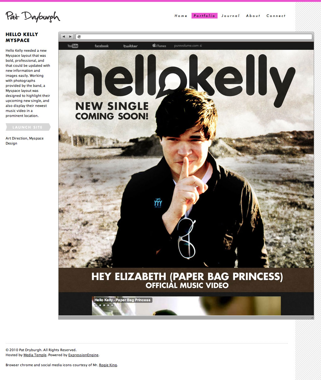
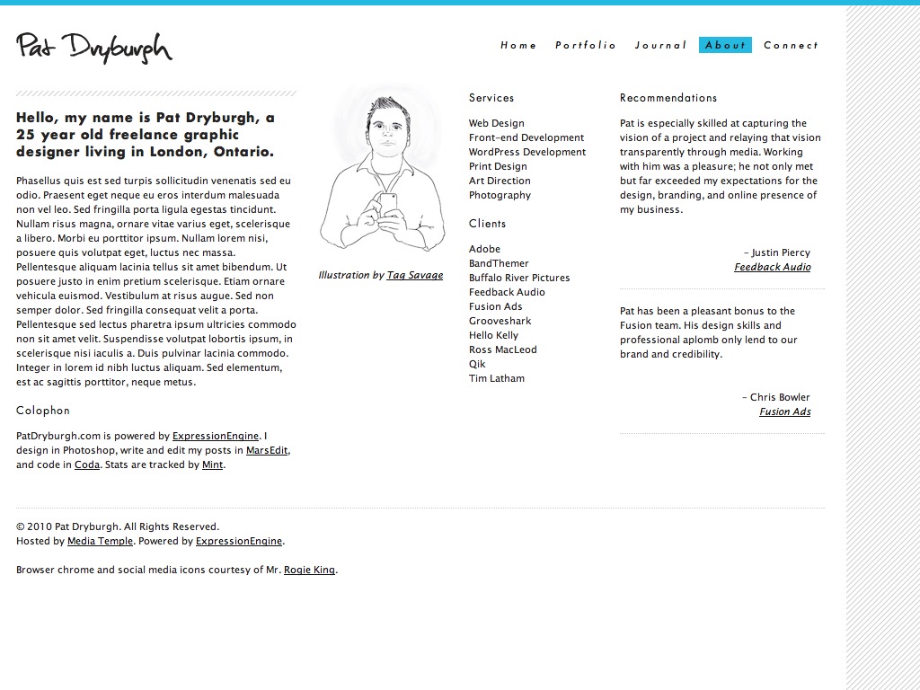
A few other things I really liked about this design:
- I like that I was able to communicate who I was and what I did in a more personal way.
- I love that each page would have its own colour scheme.
- I had just started working with Futura on the Hello Kelly Myspace design, and had started to fall in love with it.
- I liked the way I was able to have portfolio sections, differentiating between web, print, and other types of work.
- Because of the way this site was layed out, my dream was to do something similar to Jason Santa Maria, Yaron Schoen, Trent Walton and others with a more art directed approach to blogging.
This site also came very close to being fully developed. I wanted to try to learn something new, and so I used this as an opportunity to start teaching myself ExpressionEngine. I still have a bit to learn, but I feel pretty strongly that I will be offering ExpressionEngine development as a service sooner than later. It is such a joy to work with, and in my mind is even easier than Pods for the end user.
Although I really liked this design, I was not happy with what I would have to give up to launch it. I’ve really enjoyed working with Tumblr, and couldn’t imagine giving up on the platform just months after switching to it. I was also inspired by something I read on Frank Chimero’s profile:
Make only what you need, right?
While I enjoyed working on ExpressionEngine, for my purposes a combination of Tumblr and Cargo Collective is really all I need. Maybe one day in the future I’ll need some more advanced features that these services can’t offer, but for now this is the perfect combination of providing what I need and doing so in a simple, accessible manner.
Which leads me to my most recent design. I was constrained a little bit due to having the site already setup on Tumblr, which meant my home page would be a blog and not an introductory page like my ExpressionEngine site. There are pros and cons to this reality. On the pro side, I won’t be losing the audience I have developed over the last few years blogging here at PatDryburgh.com. The con is that it becomes a bit harder to communicate what exactly I do. And so, I decided the best way to circumvent this issue was to just be really clear in my site header.
The other element I wanted to make sure I highlighted in this design was my photography. While working on the Made by Athlete designs, I was just getting into photography and wasn’t certain it was something I wanted to pursue in a serious manner. Now, after just 4 months I have now worked on my first serious photo shoot and have been learning a lot. It’s definitely something I want to push in my site, so I wanted to make sure the layout of the photo posts was bold and attractive:
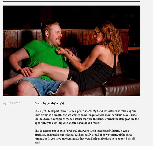
I wanted the photography to display across the full width of the post (as the screenshots in this post do as well), giving them prominence and letting the reader see the shot without having to click to see a high resolution version.
The other big change from previous designs is the use of a serif font, specifically FF Tisa Web Pro delivered by Typekit. Inspired again by Frank Chimero, as well as Liz Danzico’s Bobulate, I fell in love with FF Tisa Web Pro, and decided it was perfect for what I wanted to present: clean, delicious typography on a simple, modern layout.
I am sure there will still be tweaks to this site as time goes on, and I do have a few ideas to develop a bit of an art directed approach to some of the posts. With the move to freelance, I am sure I will have more to share about my design process, and would love to hear your thoughts as well!
※ Permalink for “The Process” published on date_to_rfc822